Why Your Designs Still Look Unprofessional (And How Professionals Fix Them)
عدد الدروس : 1 عدد ساعات الدورة : 00:13:52 شهادة معتمدة : نعم التسجيل في الدورة للحصول على شهادةللحصول على شهادة
- 1- التسجيل
- 2- مشاهدة الكورس كاملا
- 3- متابعة نسبة اكتمال الكورس تدريجيا
- 4- بعد الانتهاء تظهر الشهادة في الملف الشخصي الخاص بك
عن الدورة
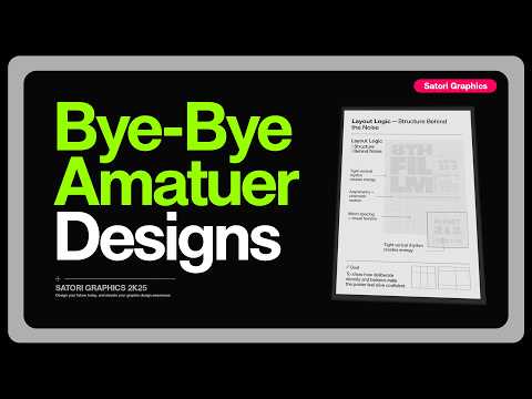
Many designers struggle with making their work look polished and professional, even after learning basic tools and software. This video breaks down the real reasons behind “unprofessional-looking” designs and shows how professionals consistently fix them using proven design principles.
One of the most important concepts covered is visual hierarchy—how to guide the viewer’s eye through a design in a clear and intentional way. Without hierarchy, designs feel messy and confusing. The video also focuses on layout structure, explaining how proper alignment, spacing, and grid systems instantly improve clarity and balance.
Typography plays a major role as well. Poor font pairing, inconsistent spacing, and weak text contrast are common mistakes that make designs look amateur. The tutorial explains how to choose and combine fonts more effectively to create harmony and professionalism.
Another key topic is spacing and composition. Many beginners overcrowd their designs or fail to leave enough breathing space between elements, which reduces readability and visual appeal. The video demonstrates how proper spacing alone can transform a design.
Overall, this lesson helps designers move beyond random styling and start thinking strategically. By applying these core principles consistently, any designer can elevate their work from beginner-level visuals to clean, modern, and professional-quality designs.


