Figma Responsive & Grid Design Tutorials – Auto Layout & UI Grids
عدد الدروس : 7 عدد ساعات الدورة : 01:50:34 شهادة معتمدة : نعم التسجيل في الدورة للحصول على شهادةللحصول على شهادة
- 1- التسجيل
- 2- مشاهدة الكورس كاملا
- 3- متابعة نسبة اكتمال الكورس تدريجيا
- 4- بعد الانتهاء تظهر الشهادة في الملف الشخصي الخاص بك
قائمة الدروس
عن الدورة
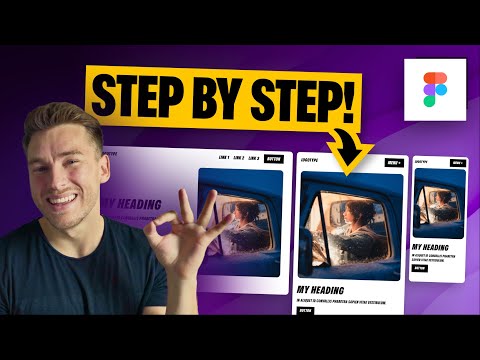
This Figma Responsive & Grid Design series teaches designers how to build flexible, scalable, and professional user interfaces using Figma. Begin with Responsive Design in Figma: Crash Course 2023, which covers foundational concepts of adaptive layouts and resizing techniques. Learn to implement responsive grids through auto-layout tutorials, understanding rows, columns, and spacing to maintain consistency across devices.
Explore the Master Responsive Grids and 8pt Grid tutorials by Tim Gabe, emphasizing practical approaches to create clean and balanced UI layouts. Discover the “Missing Guide to Grids” by Flux Academy, which dives into common pitfalls and best practices to elevate your design workflow. These lessons include setting up scalable layouts, handling constraints, and designing elements that adapt seamlessly to different screen sizes.
By completing this series, you’ll be able to efficiently structure web and mobile interfaces in Figma, ensuring visual consistency, alignment, and responsiveness. Whether you’re a beginner or intermediate designer, mastering grids and auto-layout in Figma empowers you to deliver polished, professional UI/UX designs. Perfect for designers, developers, and product teams aiming to enhance their digital design skills.


