How To: Your 15-Minute Guide to Color in Your Home
عدد الدروس : 1 عدد ساعات الدورة : 00:16:53 شهادة معتمدة : نعم التسجيل في الدورة للحصول على شهادةللحصول على شهادة
- 1- التسجيل
- 2- مشاهدة الكورس كاملا
- 3- متابعة نسبة اكتمال الكورس تدريجيا
- 4- بعد الانتهاء تظهر الشهادة في الملف الشخصي الخاص بك
عن الدورة
Color is one of the most powerful tools in interior design because it directly influences how a space feels and functions. In just a few minutes of understanding the basics, you can transform the mood of any room without changing its structure or furniture. This guide breaks down the essential principles of using color in a simple and practical way.
The process begins with understanding color psychology. Different colors create different emotional responses. Warm tones like red, orange, and yellow tend to feel energetic and inviting, while cool tones like blue, green, and grey create calm and relaxing environments. Neutral colors such as white, beige, and black act as a balanced foundation that supports other design elements.
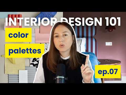
Next comes the idea of creating a color palette. A strong interior usually follows a simple rule: one dominant color, one secondary color, and one accent color. The dominant color sets the overall mood of the space, the secondary color supports it, and the accent color adds contrast and visual interest.
Balance is another key principle. Too many strong colors in one space can feel overwhelming, while too many neutral tones can feel flat. A well-balanced palette creates harmony and ensures that no single color dominates the room unnecessarily.
Lighting also plays a major role in how colors appear. Natural light can make colors look brighter and more vibrant, while artificial lighting can change their warmth or coolness. This is why it is important to test colors under different lighting conditions before finalizing a design.


